01 – Typography
Aa Zz
Garamond Premier Pro Caption
Aa Zz
Basic Sans Semi Bold
Aa Zz
Basic Sans Regular
NOTE: All screen sizes use the following type styles
Style 1: Garamond Premier Pro Caption
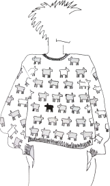
SHEEP SWEATERS NOW AVAILABLE
Style 2: Garamond Premier Pro Caption
Fall 2021 Women Clothing
Style 3: Basic Sans Semi Bold
Shop Now
Style 4: Basic Sans Regular
Lorem ipsum dolor sit amet, consectetur adipiscing elit. Ut ut magna urna. Vivamus vel magna dignissim ligula eleifend condimentum nec eget mauris. Suspendisse ac quam eleifend urna viverra posuere sodales in ligula. This is a link Nulla placerat sagittis tempor. Nunc finibus, sem vel accumsan lobortis, augue libero molestie leo, eu sagittis quam dolor quis dolor. Praesent volutpat neque sed rhoncus pharetra. Maecenas ac nisi fringilla, viverra elit quis, sodales arcu.
- This is
- an “unordered”
- or bulleted
- list
- This is
- an “ordered”
- or numbered
- list
Label: Garamond Premier Pro Caption
FOR LABELS
02 – Colors
Fills
BLACK
#000000
WHITE
#FFFFFF
SECTION GRAY
#F5F5F3
WW RED
#D90211
DIVIDERS / LINES
#EAEAEA
1PX
Typography
Black is the main text color for the majority of typography.
BLACK TEXT
#00000
Dark Gray is used when text should not be as prominent and is mostly disclaimer info.
GRAY TEXT
#4a4a4a
Disabled text/Links are 30% Opacity Black.
DISABLED TEXT
#000000, 30% Opacity
Red is used for error messages on forms and fields
RED
#D90211
Red is used for Rich Text Editor primary links
RED
#D90211
Black is used for standard links
BLACK
#000
STANDARD TEXT LINKS [same as desktop + mobile]
Is your size sold out? Email me when in stock
Default State
Is your size sold out? Email me when in stock
Hover State
Transition color 100%
#000 to 30% opacity
Is your size sold out? Email me when in stock
Focus State
1px outline, #000
RICH TEXT LINKS [same as desktop + mobile]
Is your size sold out? Email me when in stock
Default State
Is your size sold out? Email me when in stock
Hover State
Transition color 100%
#D90211 to 50% opacity
Is your size sold out? Email me when in stock
Focus State
1px outline, #000
CHECKBOX [same as desktop + mobile]
Default State
Hover State
Transition Box Border
from #000 to #EAEAEA
Mouse should be ‘cursor’
over any part of the
checkbox (box or word)
Focus State
1px outline, #000
Disabled State
30% opacity on entire
element
Active State
Checkmark shows
SIZE VARIANT SELECTOR [same as desktop + mobile]
Default State
1px #EAEAEA border
Hover State
Transition Box Border
from #EAEAEA to
#000000
Focus State
1px outline, #000
Sold Out State
Strikethrough on text,
50% Opacity on text
Active State
#000 border
COLOR VARIANT SELECTOR [same as desktop + mobile]
Default State
1px #EAEAEA border
Hover State
Transition Box Border
from #EAEAEA to
#000000
Focus State
1px outline, #000
Sold Out State
Strikethrough on color
Active State
#000 border
INPUT FIELD - DESKTOP
Default State
1px #EAEAEA border
Label text is #000 at 50% opacity
Hover State
Transition Box Border
from #EAEAEA to
#000000
Focus State
1px outline, #000
Active State
Label slides to topbar
and input field is 100%
opacity black.
If long text, gradient
appears towards the end
of the box.
Please enter a valid email address
Error State
#D90211 border
INPUT FIELD - MOBILE (SMaller height)
Default State
1px #EAEAEA border
Label text is #000 at 50% opacity
Hover State
NO HOVER STATE ON MOBILE
Focus State
1px outline, #000
Active State
Label slides to topbar
and input field is 100%
opacity black.
If long text, gradient
appears towards the end
of the box.
Please enter a valid email address
Error State
#D90211 border
DROPDOWN - DESKTOP
Default State
1px #EAEAEA border
Label text is #000 at 50% opacity
Hover State
Transition Box Border
from #EAEAEA to
#000000
Focus State
1px outline, #000
Active State
Label slides to topbar
and input field is 100%
opacity black.
If long text, gradient
appears towards the end
of the box.
Please select an option
Error State
#D90211 border
DROPDOWN - MOBILE (SMaller height)
Default State
1px #EAEAEA border
Label text is #000 at 50% opacity
Hover State
Transition Box Border
from #EAEAEA to
#000000
Focus State
1px outline, #000
Active State
Label slides to topbar
and input field is 100%
opacity black.
If long text, gradient
appears towards the end
of the box.
Please select an option
Error State
#D90211 border
PRODUCT CARD - DESKTOP
Default State
Sold Out State
Red label on image in
top left corner with white
background
On Sale State
Price crossed out and
sold out state shown in
red
Hover State
Hover transitions to
secondary product
image
Focus State
#000 border
PRODUCT CARD - MOBILE
Sold Out State
Red label on image in
top left corner with white
background.
On 2up grid, it will be in
bottom right
On Sale State
Price crossed out and
sold out state shown in
red
Focus State
#000 border
AMBIENT VIDEO CONTROLS

Default State
Ambient videos play.

Hover State
Hovering over pause
button inverts the colors.
Hovering over mute
inverts the colors.

Sound On State
Changes sound icon to
‘sound on’ SVG and
sound of music starts
playing.

Pause State
Change pause button to
play svg

Focus State
#000 border
CLOSE
Default State
Hover State
Darken background to
#DDDDDD
Focus State
Focus State
#000 border
CLOSE - Invert
Default State
Hover State
Darken background to
#DDDDDD
Focus State
Focus State
#000 border
FOOTER EMAIL SIGN UP
PAGINATION [same on desktop and mobile]
Default State
Left-most arrow is at 30% opacity
if not clickable.
Non selected numbers are at
30% opacity #000


